flex布局item的尺寸
flex-basis
flex-basis 用于设置项目(flex-item)的基础宽度,和 width 一样,flex-basis 设置的是 content-box。
项目最终宽度的优先级: 最大最小尺寸限制 > 弹性增长或收缩 > 基础尺寸
flex-shrink
设置项目的收缩比例,默认值为:1
特殊点:收缩比例的计算方式
-
计算加权值(
content-width_ 比例 +content-width_ 比例 + …… = W) -
收缩像素(
content-width/ W * 溢出像素) -
计算方式和盒模型没有关系,只和内容盒的宽度有关
-
当该项目设置
flex-basis并且内容溢出撑开盒子,该项目不参与收缩
基础尺寸
基础尺寸由 flex-basis、width、content-size 共同决定,content-size 包括文本内容和元素。
auto
当 flex-basis 为 auto 时:
width 的优先级 > content-size 的优先级,也就是说当设置了 width 时,内容无法撑开项目的宽度。
HTML
1 | <div class="wrapper"> |
CSS
1 | body { |
不为 auto
- 设置了
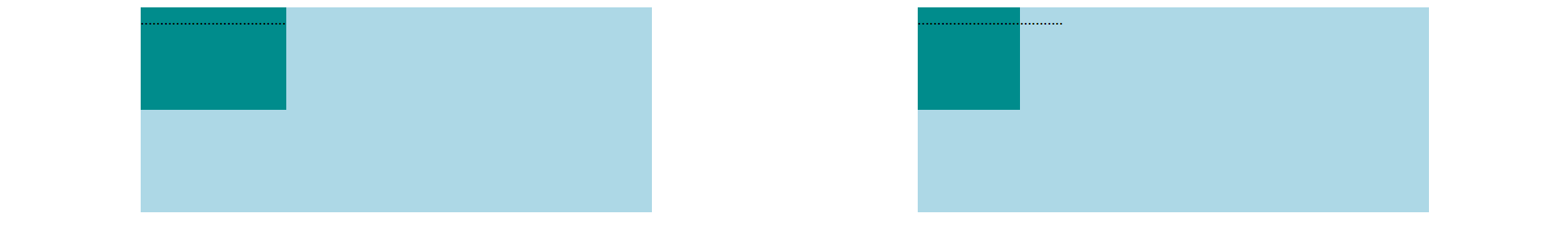
width:width > flex-basis,则flex-basis <= realWidth <= widthflex-basis >= width,则项目的宽度为flex-basis,内容不可以撑开该项目
- 没设置
width:内容可以撑开该项目
当设置了 width 且 width > flex-basis 时,优先级 content-size > flex-basis && width > content-size
HTML
1 | <div class="wrapper"> |
CSS
1 | .wrapper { |
JavaScript
1 | const box = document.querySelector(".box"); |
本博客所有文章除特别声明外,均采用 CC BY-NC-SA 4.0 许可协议。转载请注明来自 哪有多奇怪!